MyStash App
Web app Design
User journey mapping
UX Writing
UX
Research
Improved the registration flow which led to 30% reduction in drop-off rates.
Created a referral program and personalized message, which resulted in a 20% increase in referrals and user retention.
Contributed to the design system, which helped decrease inconsistencies in the design.
Improved the registration flow which led to 30% reduction in drop-off rates.
Created a referral program and personalized message, which resulted in a 20% increase in referrals and user retention.
Contributed to the design system, which helped decrease inconsistencies in the design.
Overview
MyStash is a financial management platform designed to help young adults and students build better savings habits. But a great idea isn’t enough—if users struggle to get started, they won’t stay.
As a UX Research and Design Intern, my role was to uncover user pain points and optimize key experiences—particularly registration, saving workflows, and engagement features.


Every app has challenges, ours wasn’t any different
Every app has challenges, ours wasn’t any different
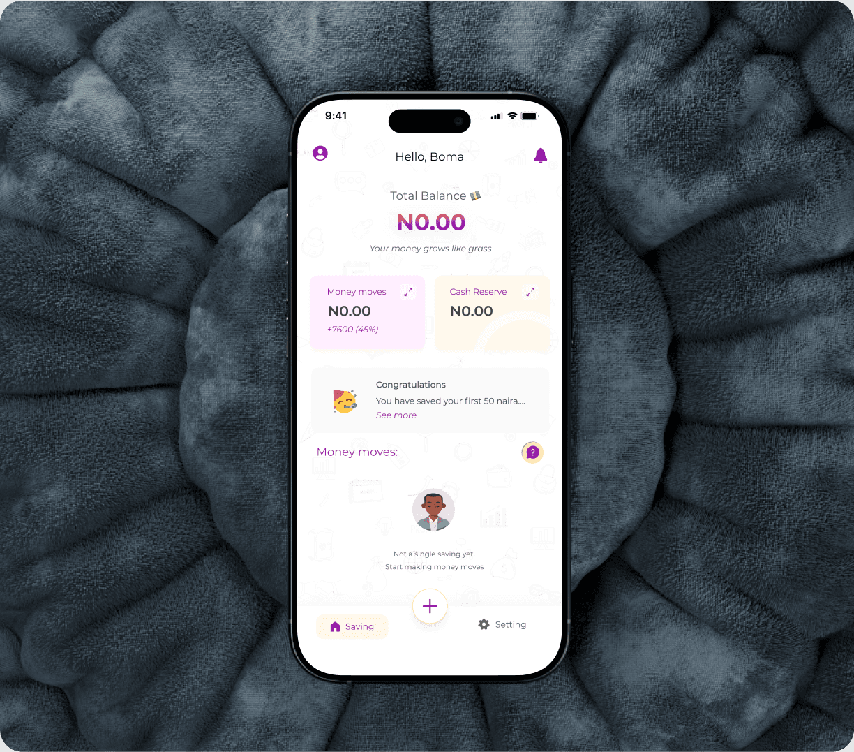
New users encountered difficulties during registration, which led to connecting the wrong bank accounts on several occassions.
New users encountered difficulties during registration, which led to connecting the wrong bank accounts on several occassions.
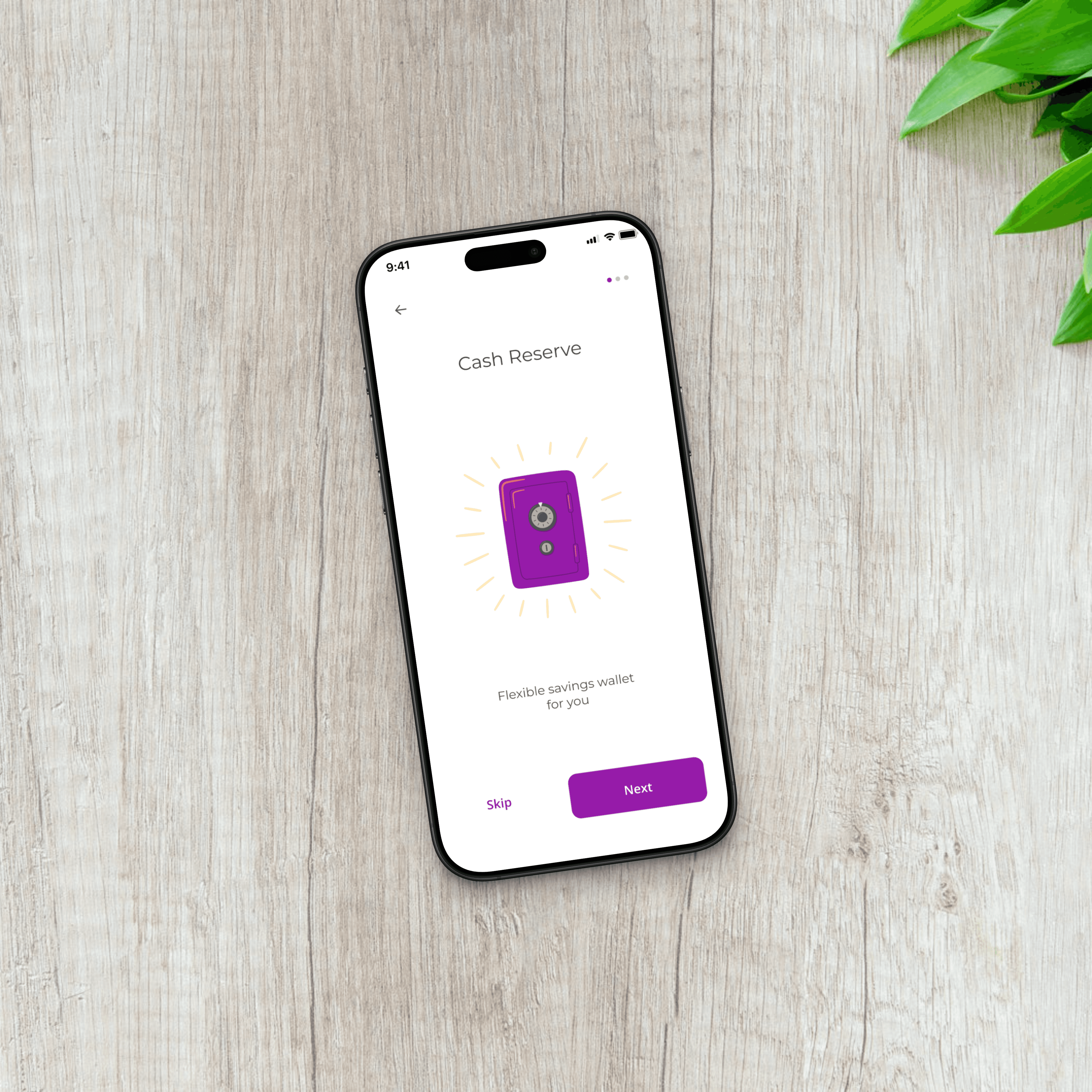
The cash reserve page had a 30% drop off rate due to an overly complex screen.
The cash reserve page had a 30% drop off rate due to an overly complex screen.
Users found it difficult to understand savings process at MyStash
Users found it difficult to understand savings process at MyStash
Solution and Goals
Simplify User Registration: Ensure that users can easily link their bank accounts and verify their accounts through a seamless, informative process.
Simplify User Registration: Ensure that users can easily link their bank accounts and verify their accounts through a seamless, informative process.
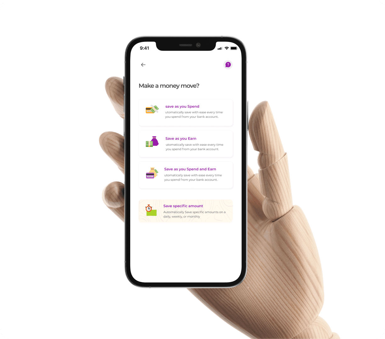
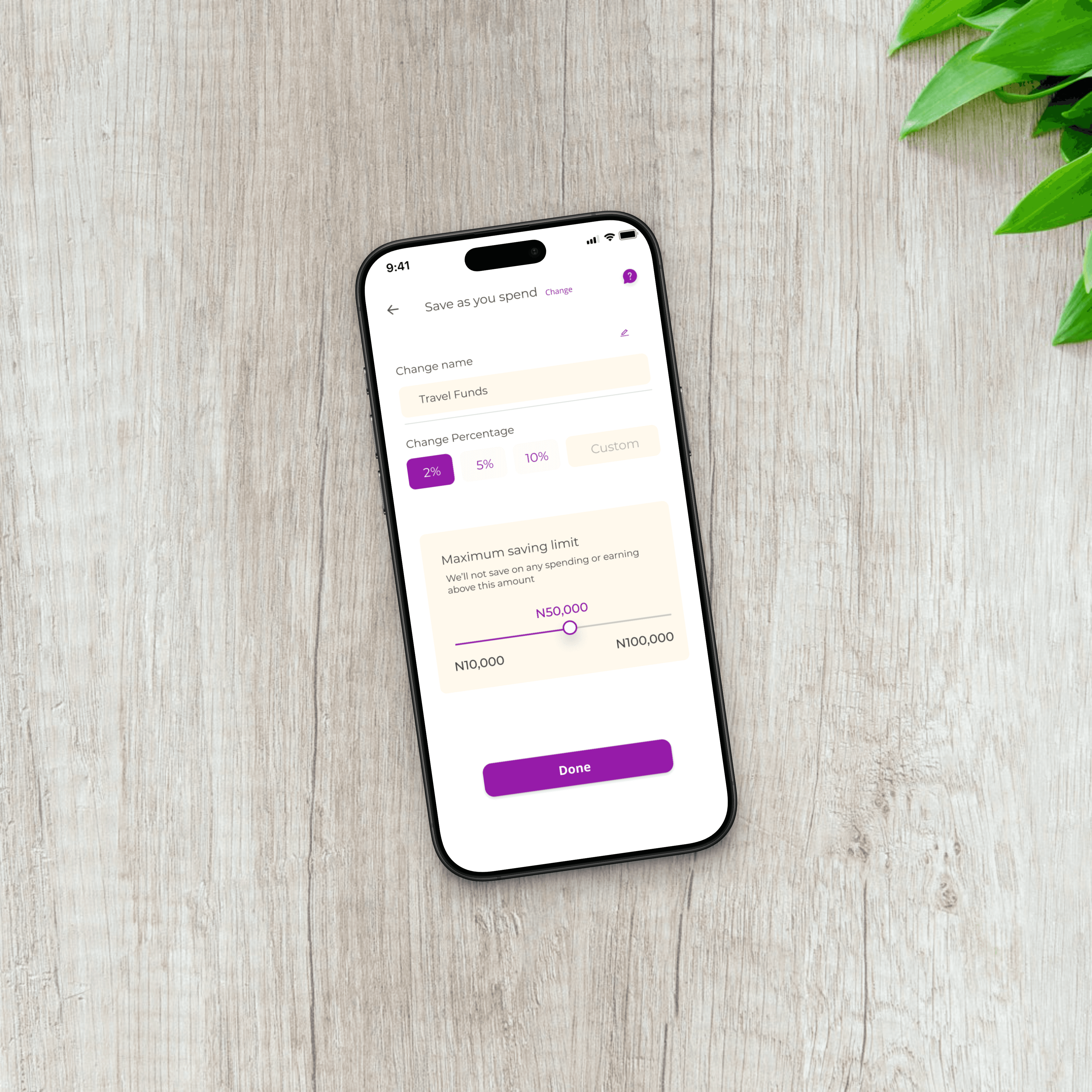
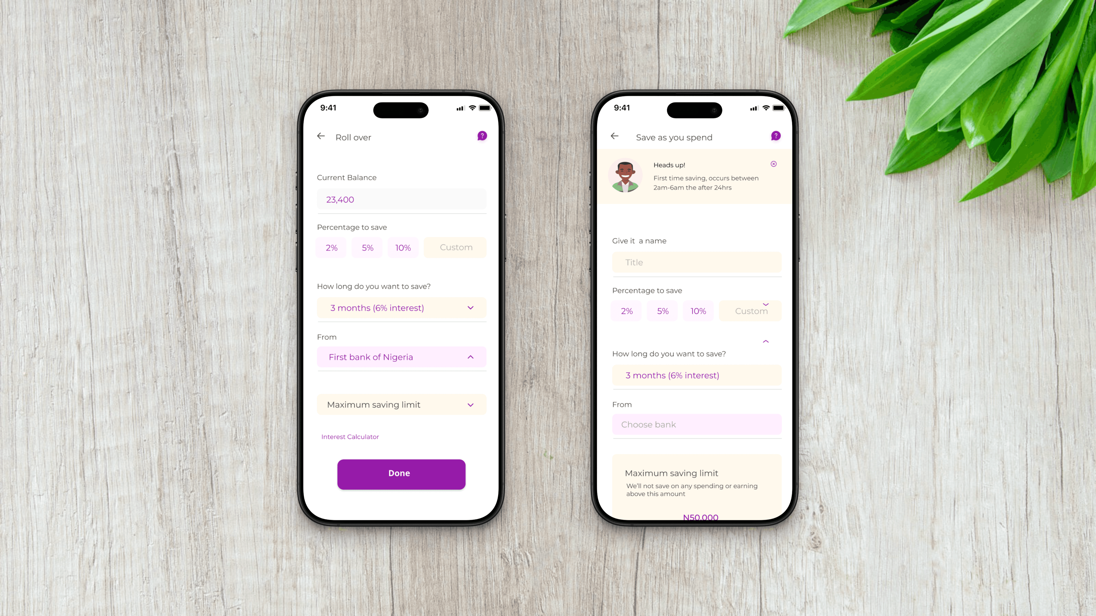
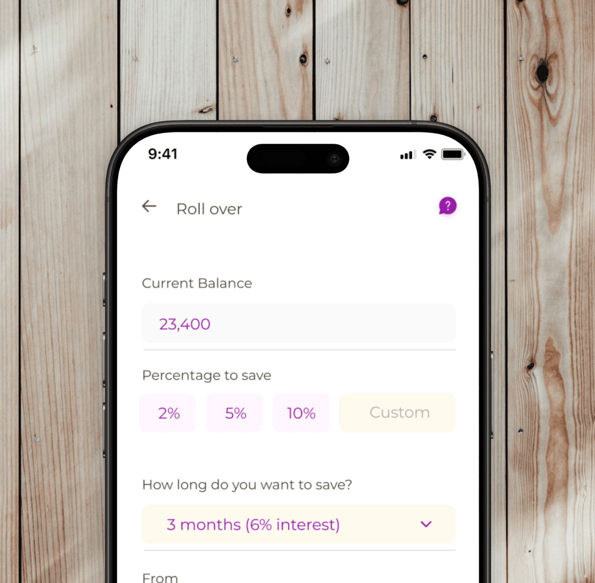
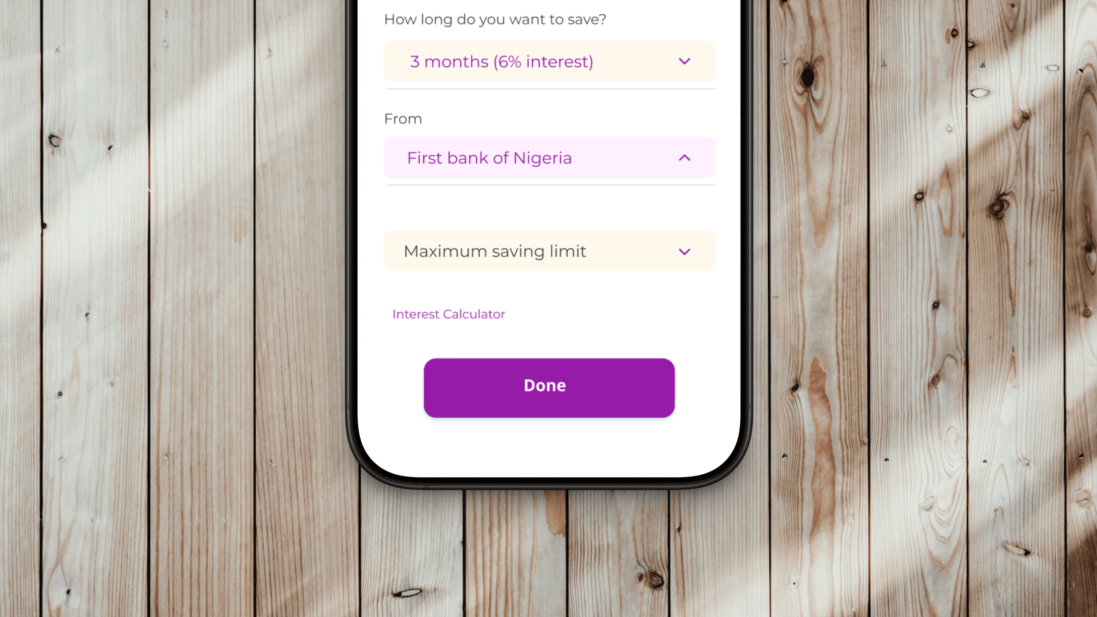
Enhance the Cash Reserve Page: Create a more engaging, wallet-like experience for users, shifting from a bland, robotic design to a friendly, informal interface
Enhance the Cash Reserve Page: Create a more engaging, wallet-like experience for users, shifting from a bland, robotic design to a friendly, informal interface
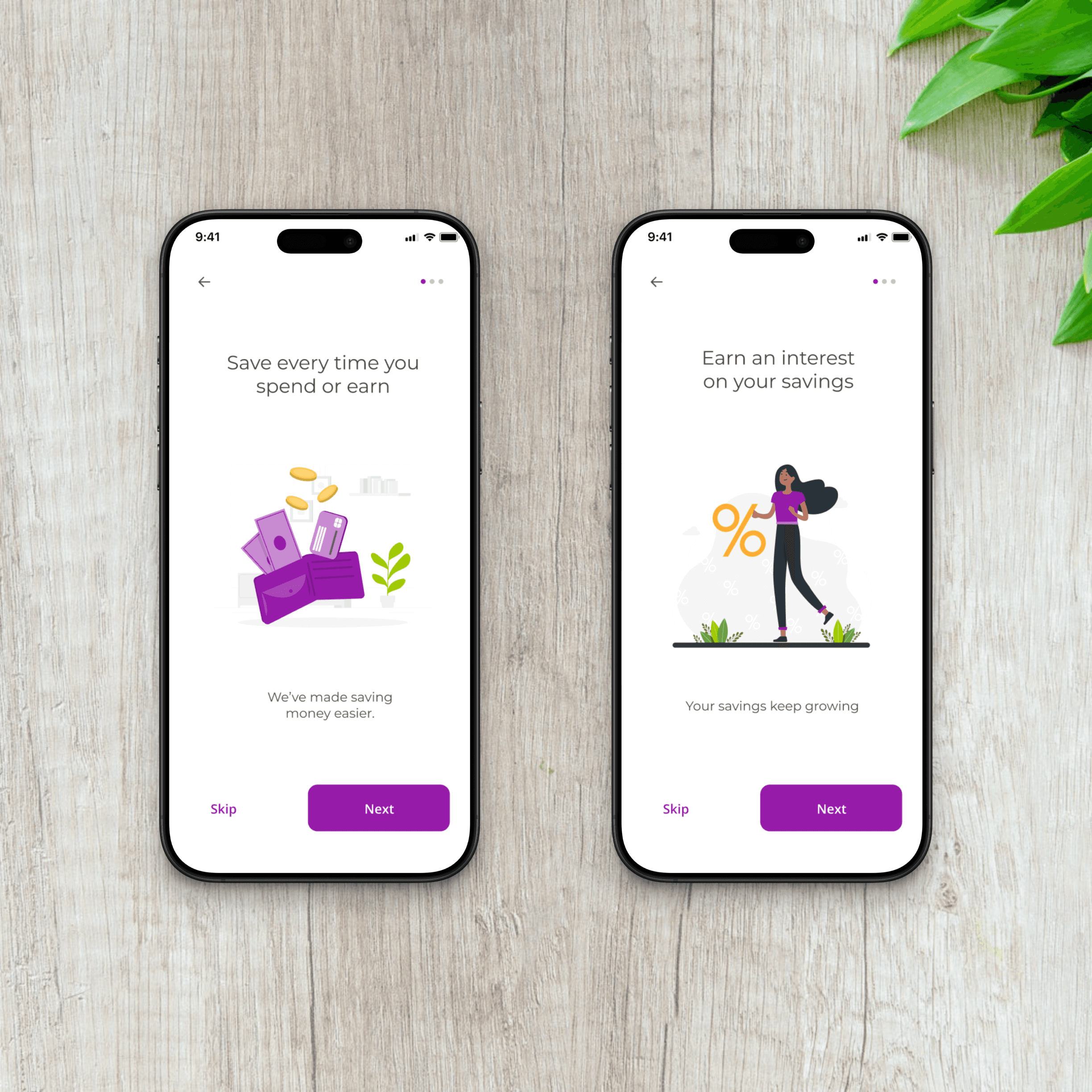
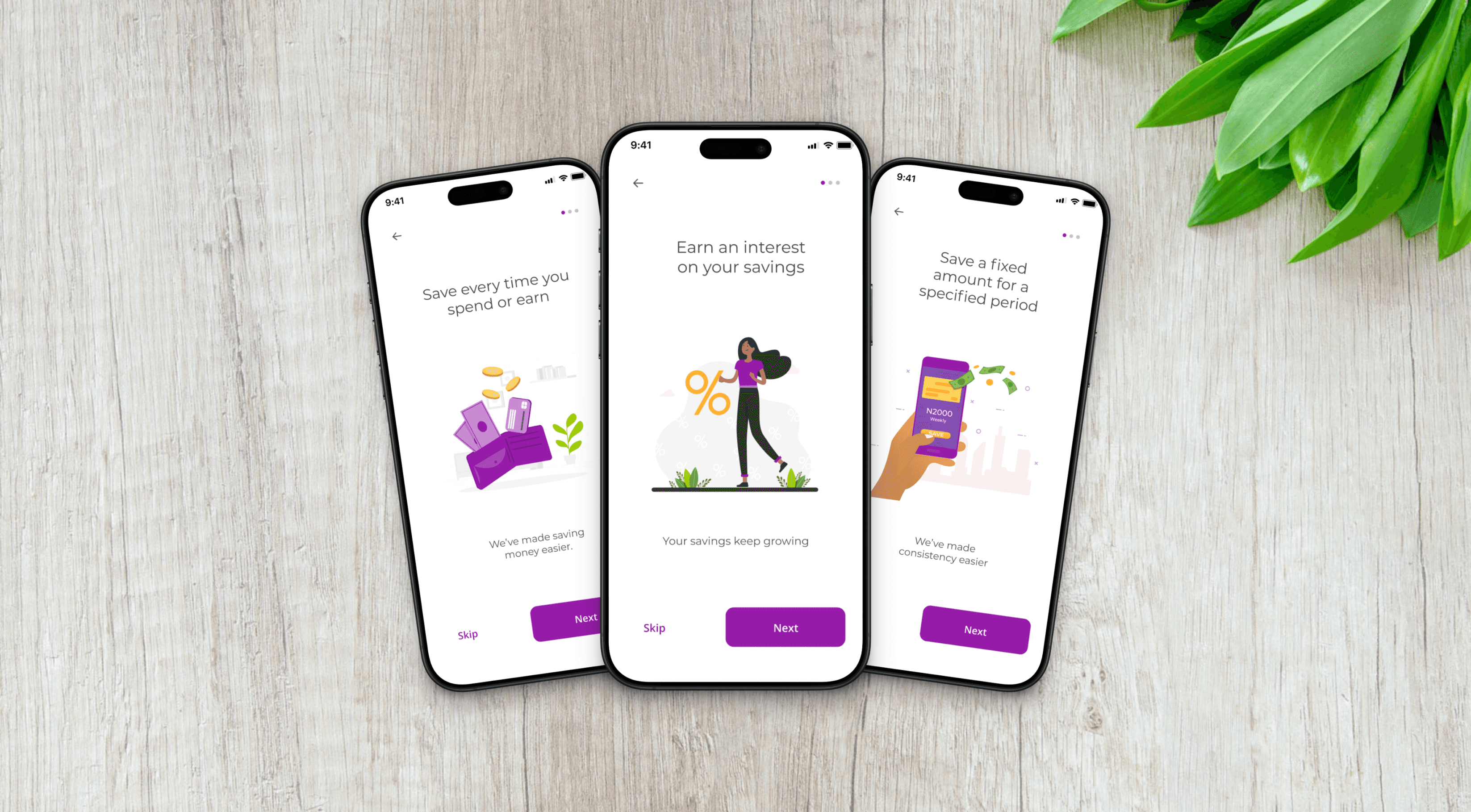
Increase User Engagement: Implement a referral bonus system for students and personalized congratulatory messages for saving milestones to foster long-term engagement and retention.
Increase User Engagement: Implement a referral bonus system for students and personalized congratulatory messages for saving milestones to foster long-term engagement and retention.
Design Process
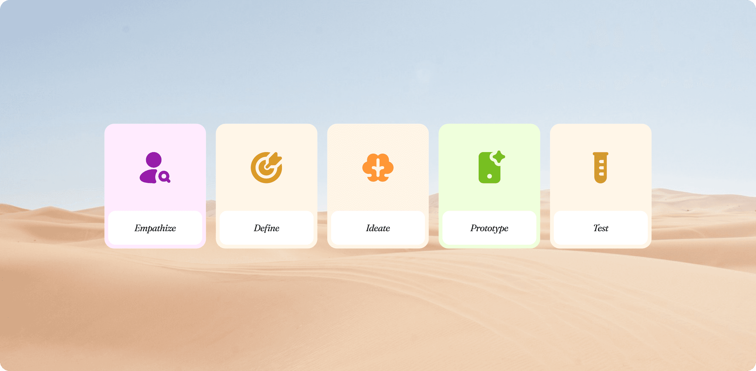
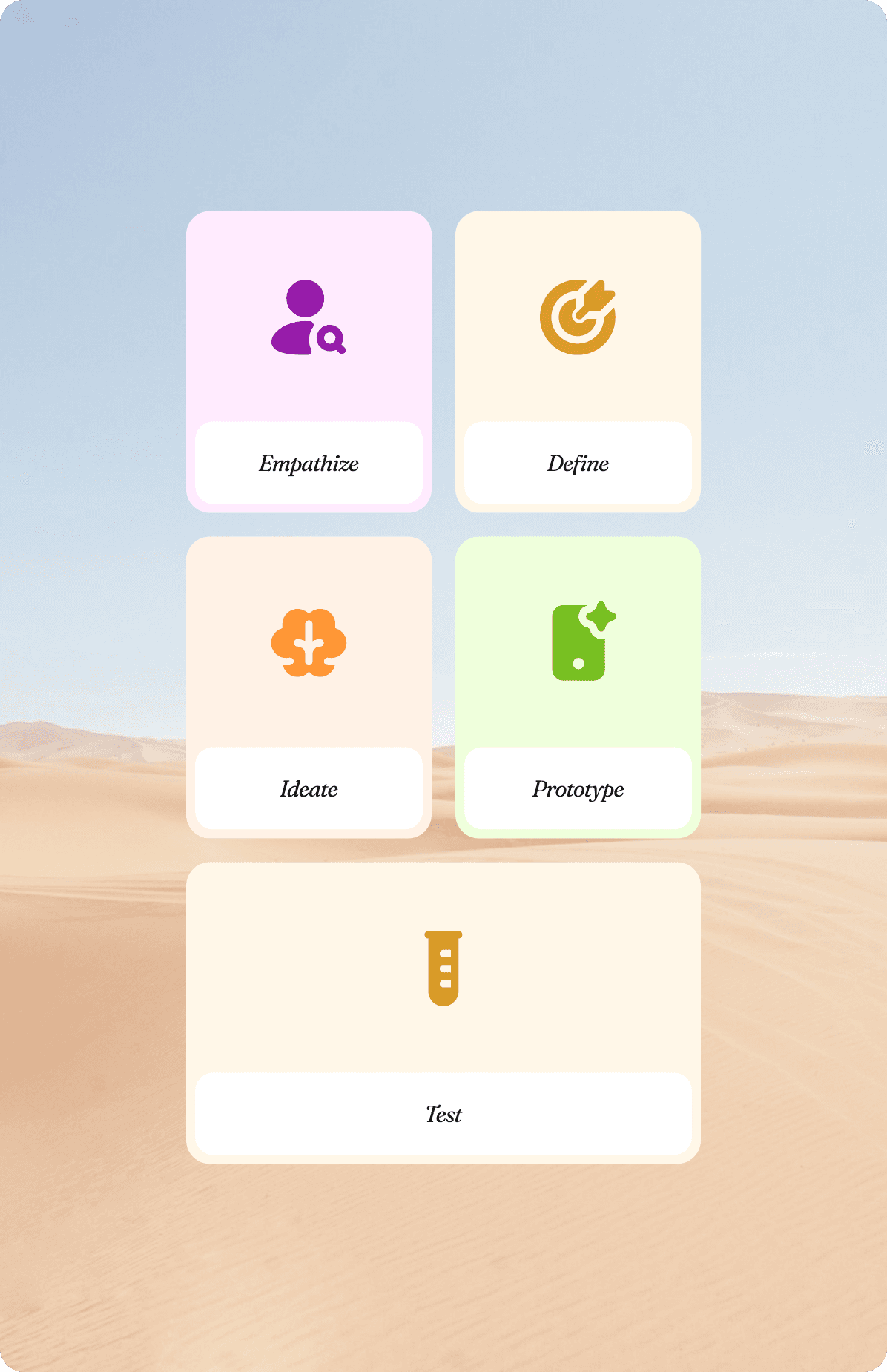
Our design process at MyStash followed the design thinking theory. We aimed at incorporating the following key steps/phases in all of our work.
Empathize: Conducting user research to understand frustrations and needs.
Define: Identifying key pain points affecting user adoption and engagement.
Ideate: Brainstorming solutions, including simplified flows and incentive systems.
Prototype: Creating wireframes, mockups, and interactive prototypes.
Test & Iterate: Launching analyzed metrics, and refined based on real user feedback.
The Approach
I began by empathizing with users through interviews and surveys to understand their pain points, such as low engagement and high drop-offs. Based on these insights, I defined the key challenges—simplifying registration and making saving more rewarding. I then ideated solutions like streamlining registration and introducing engaging features, which I prototyped and tested with users.
Finally, I submitted the results and the lead designer and I iterated on the designs, refining the experience based on feedback and data to improve retention and conversions.
Gathering data and insights
To truly understand why users struggled with myStash, I relied on both direct and indirect research methods to uncover their frustrations, hesitations, and expectations. Rather than just analyzing numbers, I immersed myself in the user experience—observing, documenting, and even interacting with users firsthand.
While I wasn’t the one conducting user interviews, I was fully involved in the process. I worked closely with a senior team member, to document findings from interviews. This gave me deep insights into the registration challenges, drop-off patterns, and the confusion users experienced while navigating the app.
To go beyond structured interviews, I personally reached out to users under the guise of customer support. These casual conversations revealed what traditional interviews couldn’t. Users were more open about their struggles, allowing me to gather deeper insights into their pain points and expectations.
By analyzing where users abandoned the app, I could pinpoint friction points in the user journey.
- Where did they get stuck?
- What made them hesitate?
- Why did they leave before completing key actions like linking their bank accounts or saving money?
These patterns told a clear story of where improvements were needed. Beyond direct conversations, I also analyzed customer support messages and complaint logs. These provided recurring issues—problems users encountered again and again. This was key in identifying urgent pain points.

Defining key areas
After gathering insights from user interviews, direct user interactions, and behavioral analysis, I worked with the team to refine the most critical problem areas. Instead of making assumptions, we focused on key pain points that consistently surfaced across different research methods.
Many users linked the wrong bank accounts during registration, leading to frustration and failed transactions. The challenge was clear:
- How can we make the linking process better?
- How can we reduce errors and ensure users successfully verify their accounts on the first attempt?
The cash reserve page had a 30% drop-off rate, and users often abandoned it before saving. A deeper analysis revealed that:
- The interface felt impersonal and overly complex.
- Users didn’t fully understand how the feature worked.
- There was no motivation to use it consistently.
We needed to transform the page into something intuitive, welcoming, fun and engaging —making saving feel effortless rather than like a chore.
Users didn’t feel connected to the app beyond their initial interactions. Many signed up but didn’t return. The key questions became:
- How do we encourage users to keep using myStash?
- What incentives can we introduce to make saving a rewarding habit?
This led us to explore referral bonuses, personalized congratulatory messages, and milestone rewards —elements designed to make myStash feel less transactional and more like a trusted financial companion.
By defining these problem areas with precision, we ensured that every design decision directly solved real user frustrations. It wasn’t just about making the app look better—it was about making it work better for the people who needed it most.
Brainstorming
I worked alongside the team in multiple brainstorming sessions, collaborating with stakeholders, developers, and even the customer service team to ensure we were all aligned. We didn’t just want to fix problems; we wanted to create an experience that would engage users and keep them coming back.
Our approach wasn’t just internal. We interviewed users, conducted surveys, and gathered feedback from different teams (developers, stakeholders, and customer service) to understand their pain points and aspirations.
We didn't want to
fix problems
we wanted to
create an experience
that would
engage users
and keep them coming back
Designing the solutions
I participated in brainstorming, iterating, and prototyping with the team to find the best solutions and we did the following:
We revamped registration flow: It became more clear, had intuitive design, and helpful guidance (such as onboarding and visual cues) to reduce errors.
We redesigned the cash reserve page: We made it feel more like a wallet—intuitive, welcoming, and focused on saving.
We introduced engagement boosters: We also added referral bonuses and personalized milestone messages to create a rewarding experience.

Testing with users
After launching these updates, we tested and gathered feedback from users and they were satisfied with the changes. The results were also evident in registration drop-offs, referrals and returning users and consistency in UI and UX across the platform.
After launching these updates, we tested and gathered feedback from users and they were satisfied with the changes. The results were also evident in registration drop-offs, referrals and returning users and consistency in UI and UX across the platform.
The Outcome
The changes we implemented didn’t just improve the interface, they transformed the experience. By focusing on real user pain points, we created an intuitive platform that felt natural, motivating, and rewarding.
We simplified the onboarding process, redesigned the cash reserve page to make saving feel effortless, and introduced engaging features like referral bonuses and personalized messages. These tweaks helped turn frustration into motivation. Users didn’t just want to stay, they wanted to come back.
Impact
Once we put the solutions in effect, we noticed:
30% reduction in registration drop-offs
20% increase in referrals and user retention
Improved consistency across the platform’s UI and UX
These changes weren’t just about making the platform look better, they made it work better for users, helping them take control of their finances and stay engaged with the app longer.
Other Projects
Cactus
Designed an educational platform for developers
Cactus
Designed an educational platform for developers
Cactus
Designed an educational platform for developers
Learnpally
Improving User Engagement & Referrals
Learnpally
Improving User Engagement & Referrals
Learnpally
Improving User Engagement & Referrals
Get in touch, Let’s create amazing products.
Get in touch, Let’s create amazing products.
Get in touch, Let’s create amazing products.
Get in touch, Let’s create amazing products.