
Learnpally
Web app Design
Mobile Design
User journey mapping
UX Writing
UX
Research
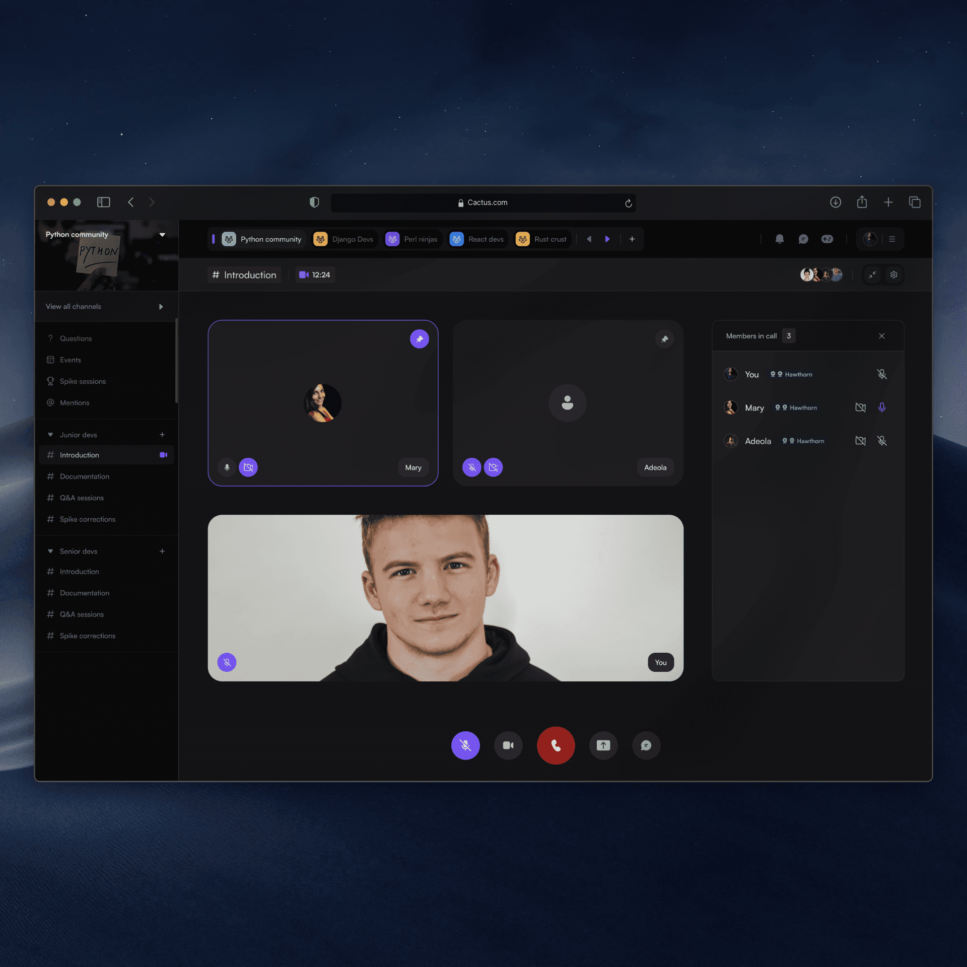
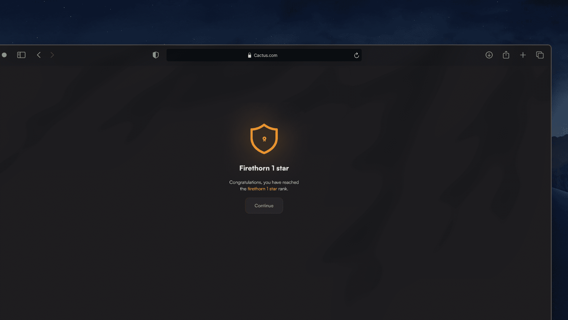
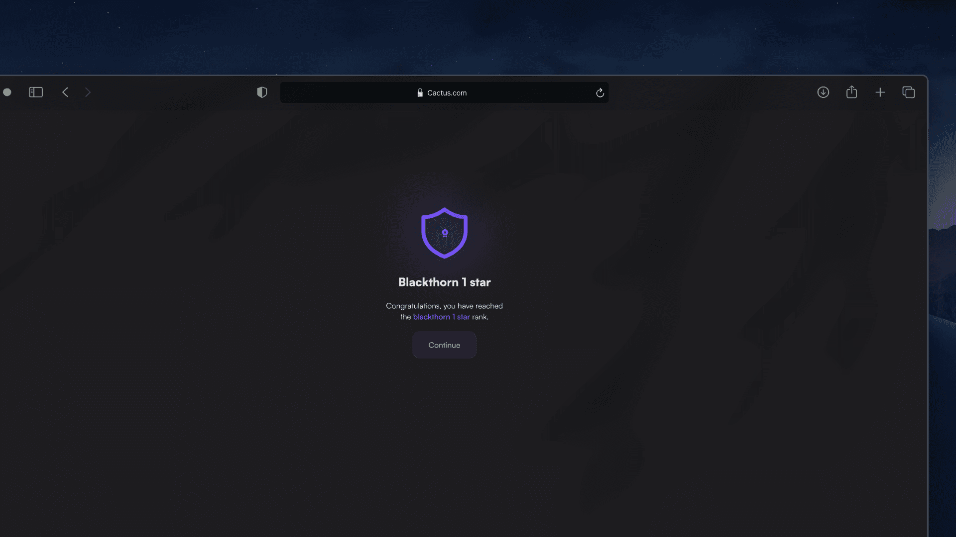
Designed a timer for our scholarship quiz which increased user participation from 2k+ to 10k+.
The copy encouraged users to invite friends and earn points, contributing to a 20% increase in referrals and user retention.
Overview
At Learnpally, my mission has always been to make learning more accessible and engaging. I understand that to truly transform how people learn, I need to focus not just on content but also on how users interact with the platform. Recently, two key challenges caught my attention: missed deadlines and low engagement, and frustrations with the referral code process.
Users were not taking action on scholarship quizzes and limited-time payment promotions because they lacked a clear sense of urgency. The feeling of "I'll get to it later" became a common theme, and as a result, many users missed valuable opportunities. On top of that, the referral code process, though simple, was creating friction. Users repeatedly clicked the "Copy Code" button, unsure if their action had been successful, leading to frustration and decreased referral participation.
I knew I could do better. The solution lay in small, strategic changes to the user experience—changes that would improve engagement and make interactions more seamless.

Solution and Goals
I had one main goal: to create a more engaging, intuitive, and effective user experience by addressing these challenges directly. Specifically, I aimed to:
Encourage higher engagement in scholarship quizzes and promotions by creating a sense of urgency.
Simplify the referral code process, reducing user confusion and increasing participation.
Implement small but impactful UX tweaks that would improve user confidence without disrupting the overall experience.
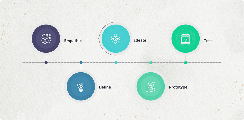
Design Process
Empathize
I started by checking user behavior data on Mixpanel to understand what was really going on. Two main issues stood out:
People were missing out on scholarship quizzes and promos, probably because they didn’t know how much time they had left.
On the referral page, users kept clicking “Copy Code” multiple times. It was clear they weren’t sure if the code had actually been copied.
Define:
From the data, I narrowed it down to two key problems:
No urgency: Users needed a better way to know when something was ending.
No feedback: After copying a referral code, there was no clear sign that anything had happened.
Ideate:
I listed out a few simple ways to fix these without overcomplicating the platform:
For urgency: Add countdown timers on quiz and promo pages so users know how much time is left.
For feedback:
Change the button text from “Copy Code” to “Copied” after clicking.
Switch the button color (e.g., blue to green) to show it worked.
Add a small checkmark animation.
Make the button grow slightly to catch attention.
Prototype:
I made the changes based on the ideas:
Countdown timers were added to show deadlines clearly.
For the referral button, I:
Changed the text to “Copied”
Updated the button color after the click
Made the button briefly expand during the change
Test:
After launching everything, I checked the results on Mixpanel:
More people started joining quizzes and paying during promos.
The countdowns helped them take action faster.
The referral button issue was resolved, people clicked once and moved on, so the frustration was gone.
The Approach
I began by empathizing with users through interviews and surveys to understand their pain points, such as low engagement and high drop-offs. Based on these insights, I defined the key challenges—simplifying registration and making saving more rewarding. I then ideated solutions like streamlining registration and introducing engaging features, which I prototyped and tested with users.
Finally, I submitted the results and the lead designer and I iterated on the designs, refining the experience based on feedback and data to improve retention and conversions.
Gathering data and insights
To truly understand why users struggled with myStash, I relied on both direct and indirect research methods to uncover their frustrations, hesitations, and expectations. Rather than just analyzing numbers, I immersed myself in the user experience—observing, documenting, and even interacting with users firsthand.
While I wasn’t the one conducting user interviews, I was fully involved in the process. I worked closely with a senior team member, to document findings from interviews. This gave me deep insights into the registration challenges, drop-off patterns, and the confusion users experienced while navigating the app.
To go beyond structured interviews, I personally reached out to users under the guise of customer support. These casual conversations revealed what traditional interviews couldn’t. Users were more open about their struggles, allowing me to gather deeper insights into their pain points and expectations.
By analyzing where users abandoned the app, I could pinpoint friction points in the user journey.
- Where did they get stuck?
- What made them hesitate?
- Why did they leave before completing key actions like linking their bank accounts or saving money?
These patterns told a clear story of where improvements were needed. Beyond direct conversations, I also analyzed customer support messages and complaint logs. These provided recurring issues—problems users encountered again and again. This was key in identifying urgent pain points.

Defining key areas
After gathering insights from user interviews, direct user interactions, and behavioral analysis, I worked with the team to refine the most critical problem areas. Instead of making assumptions, we focused on key pain points that consistently surfaced across different research methods.
Many users linked the wrong bank accounts during registration, leading to frustration and failed transactions. The challenge was clear:
- How can we make the linking process better?
- How can we reduce errors and ensure users successfully verify their accounts on the first attempt?
The cash reserve page had a 30% drop-off rate, and users often abandoned it before saving. A deeper analysis revealed that:
- The interface felt impersonal and overly complex.
- Users didn’t fully understand how the feature worked.
- There was no motivation to use it consistently.
We needed to transform the page into something intuitive, welcoming, fun and engaging —making saving feel effortless rather than like a chore.
Users didn’t feel connected to the app beyond their initial interactions. Many signed up but didn’t return. The key questions became:
- How do we encourage users to keep using myStash?
- What incentives can we introduce to make saving a rewarding habit?
This led us to explore referral bonuses, personalized congratulatory messages, and milestone rewards —elements designed to make myStash feel less transactional and more like a trusted financial companion.
By defining these problem areas with precision, we ensured that every design decision directly solved real user frustrations. It wasn’t just about making the app look better—it was about making it work better for the people who needed it most.
Brainstorming
I worked alongside the team in multiple brainstorming sessions, collaborating with stakeholders, developers, and even the customer service team to ensure we were all aligned. We didn’t just want to fix problems; we wanted to create an experience that would engage users and keep them coming back.
Our approach wasn’t just internal. We interviewed users, conducted surveys, and gathered feedback from different teams (developers, stakeholders, and customer service) to understand their pain points and aspirations.
Impact
Once we put the solutions in effect, we noticed:
30% reduction in registration drop-offs
20% increase in referrals and user retention
Improved consistency across the platform’s UI and UX
These changes weren’t just about making the platform look better, they made it work better for users, helping them take control of their finances and stay engaged with the app longer.
Other Projects
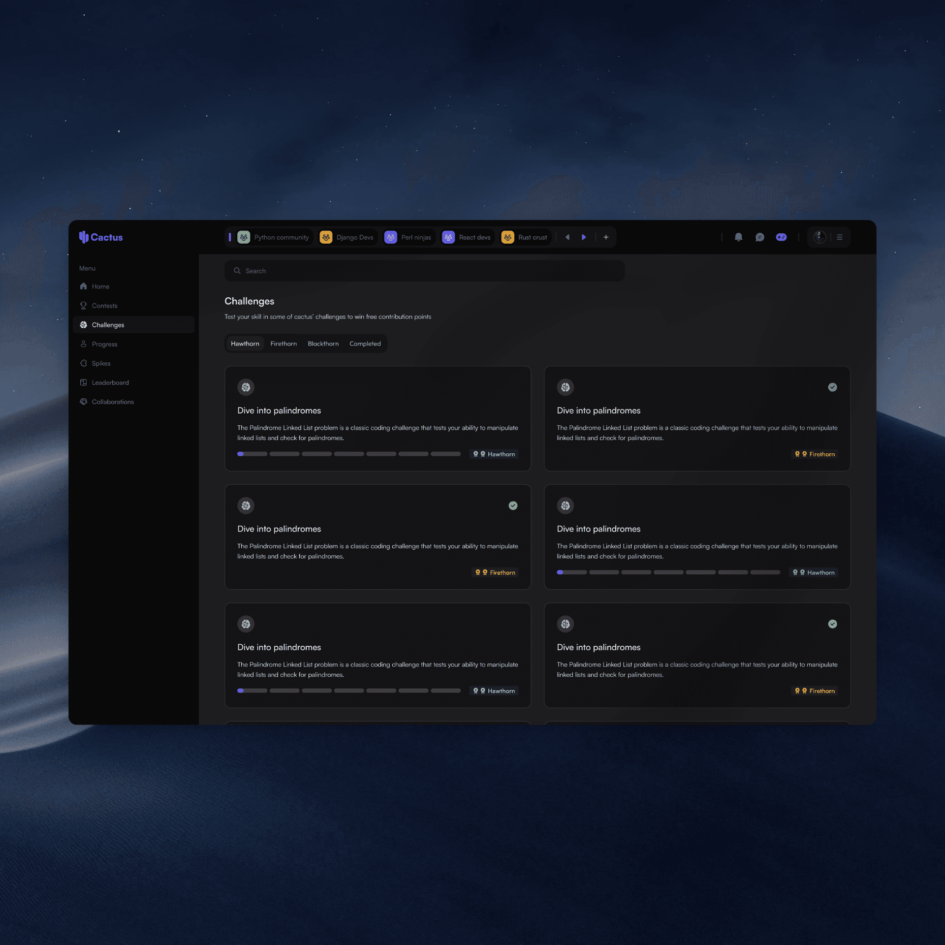
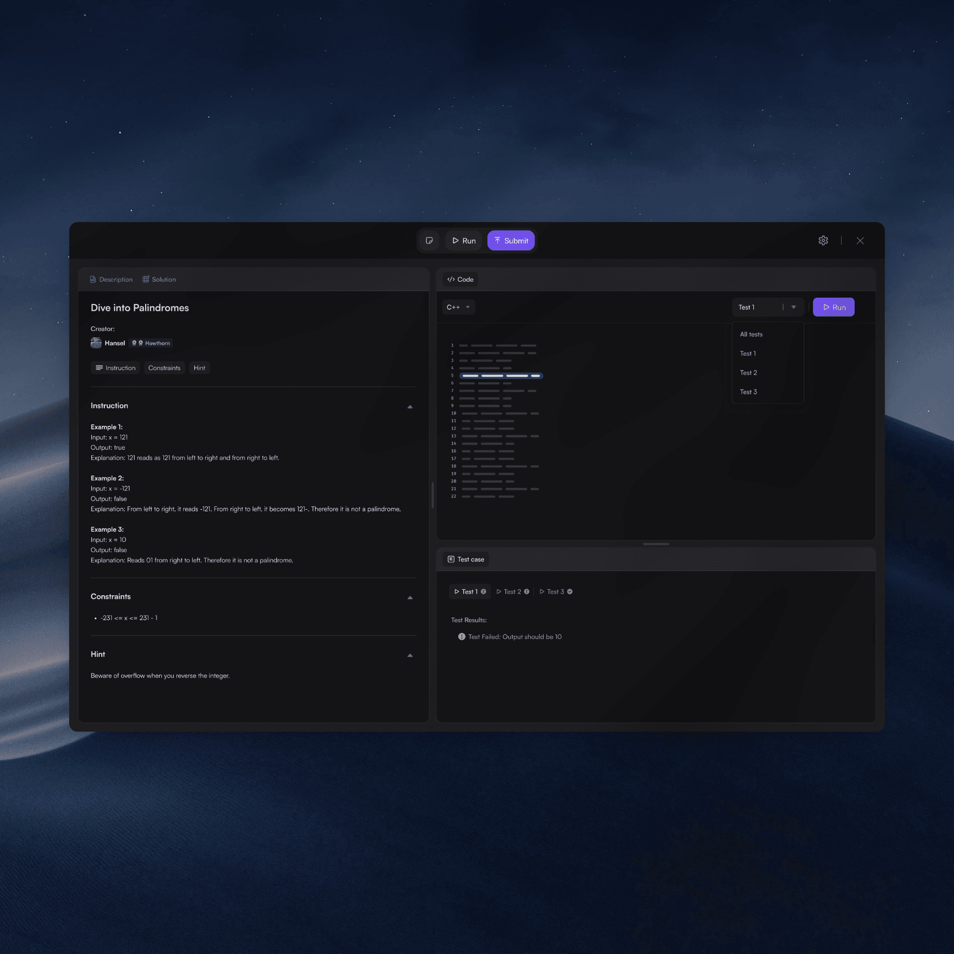
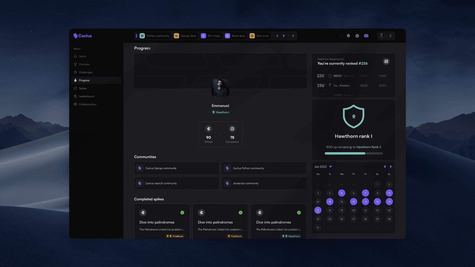
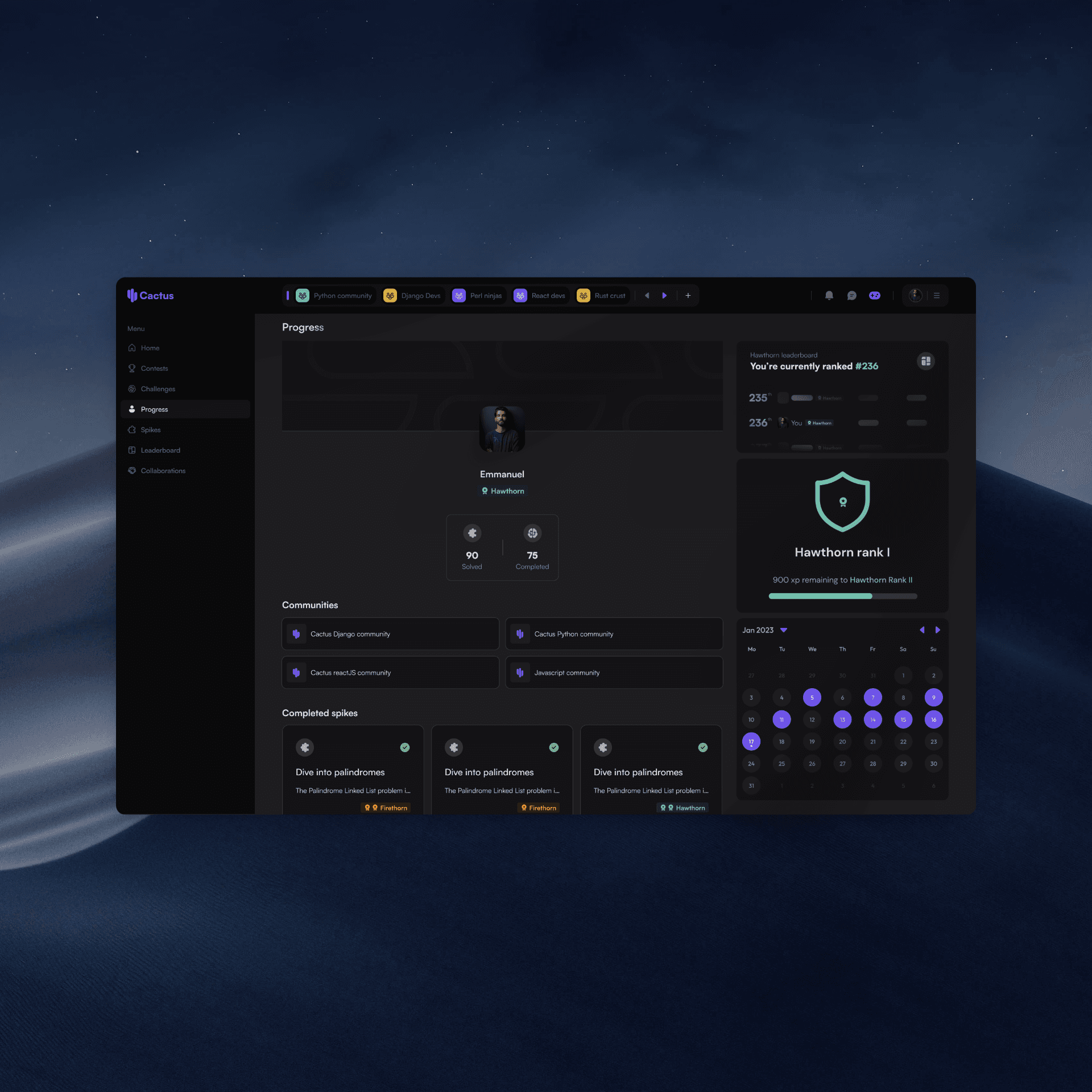
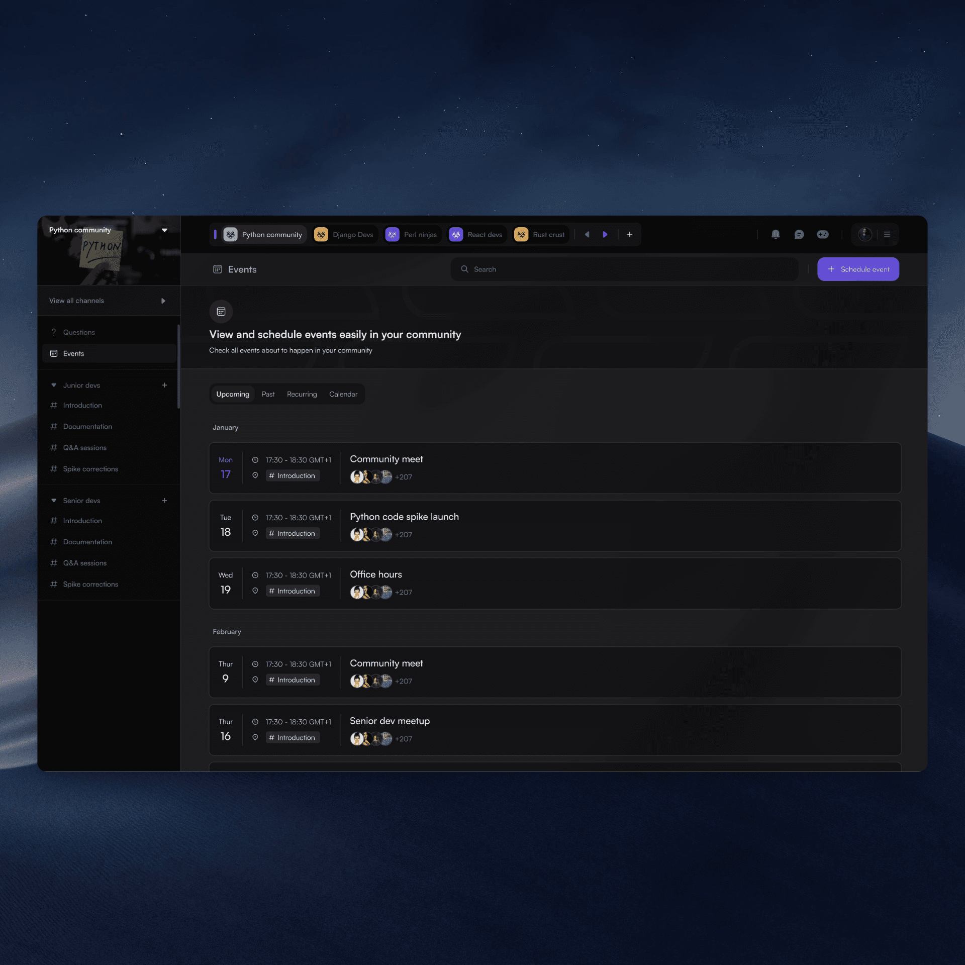
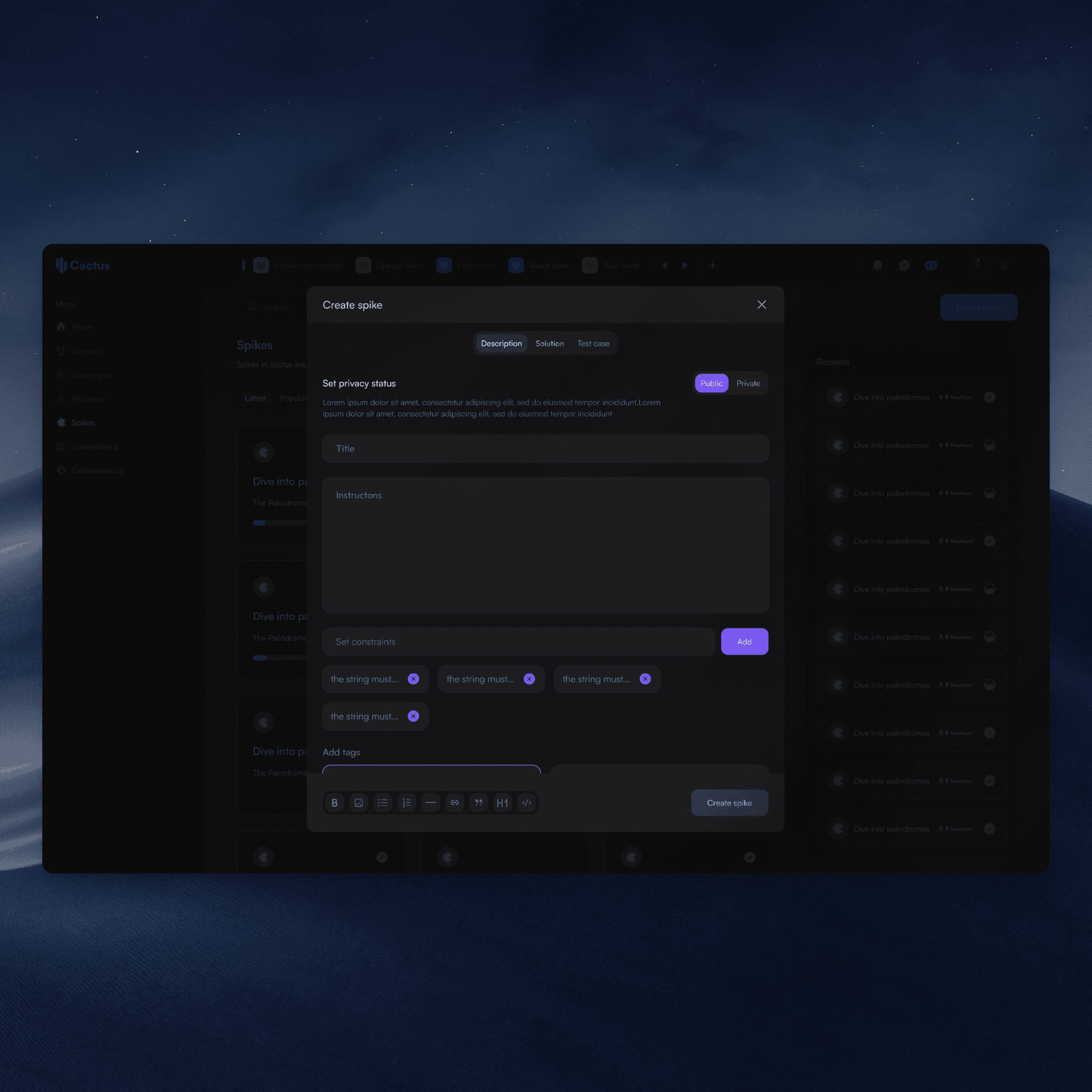
Cactus
Designed an educational platform for developers
Learnpally
Improving User Engagement & Referrals